Multiplicity
|
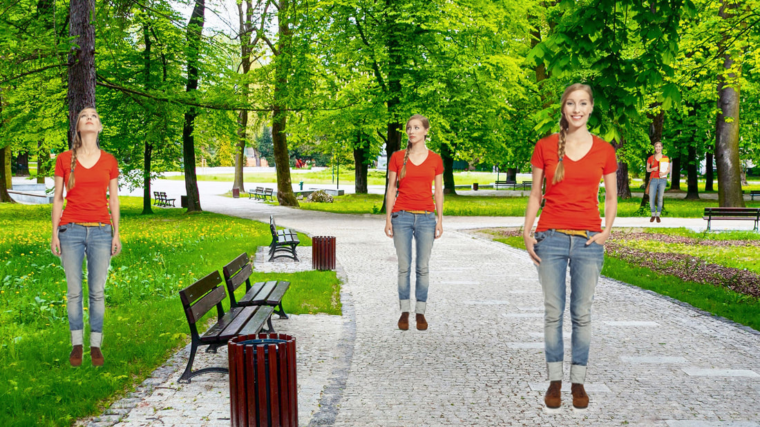
This was the stock photo multiplicity I created to practice masking the image layers in order to remove the backgrounds off the multiple images. I began by importing the first image and creating a linked image to allow the background to be removed on the girl. I used the brush tool to erase the while around the girl. I repeated that process with each image. At the end I arranged the multiple images of the same girl strategically in the given setting. This was a practice piece to become familiar with the program and technique.
|
|
I started this multiplicity assignment by importing my 6 photos into Lightroom. I made sure to brighten up the room and adjust the lighting in each picture. It was important that I made the adjustments the exact same for each picture so it matched the original image when I go to place the multiple pictures together. I used the burn tool on the program to blacken the TV. There were too many reflections and it was really taking away from the multiple images. I made sure to keep a small reflection of my hat in the corner to still make it look realistic instead of a flat black rectangle. I then embedded the images one by one into Photoshop. The main image I worked around was me standing by the tree. I added on each image repeating the masking process 5 times. It was very difficult at first to do this because I was confused by what I had to erase since the background is the exact same on each image. It really helped to block out all of the other layers and just focus on one at a time so I could see what I was doing. I knew afterward if I needed to fix any areas I could go back in with the brush tool to fill or erase any mistakes. Overall, I love how this fun Christmas scene turned out. Normally Christmas is very relaxed in my house so I wanted to put a twist on it and create a little chaotic scene. Christmas is my favourite holiday and I am very happy with how this turned out. I payed very good attention to space and placement but one thing I wish I could change is the amount of negative space at the top where the ceiling is and I would have liked to remove one of the multiples of me on the couch to create a better balance.
|
Christmas Collaboration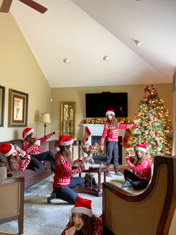
|
Poster Assignment- "Stay Positive"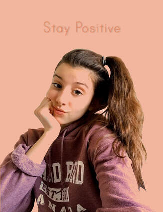
|
I started off this project by taking a selfie I had taken and remove the background. After I created that layer I chose a salmon colour for the background because it complimented and blended with the purple sweatshirt. I chose one of the blend modes that combined the background and sweatshirt nicely. Lastly I played around with different fonts until I found one that tied in with the image and background. I made it a slightly darker orange and also added a shadow on the text. I chose the words "Stay Positive" because I am a very positive girl and I like to live around happiness and spreading positivity. During quarantine, I feel that people need to be reminding of this. This is a time where we need to spread positivity in order to get better and stronger as a community.
|
Photography Scavenger Hunt
This assignment was very eye opening and different from some of the others. I had to improvise of many pictures for example, I could not find a real bug so I used a crystal ladybug instead and put it in a natural setting. There was a lot of content that needed to be edited in the end so I tried my best to organize everything by number to keep track. A lot of the photos took a long time to capture. There was definitely a lot of trial and error, especially with the forced perspective shot. There are some photos in this assignment that I edited in black and white to give a different approach. This really set the mood and gave the images a darker and deeper meaning. Many of the vibrant images were enhanced on either my phone or Pixlr. Overall, this assignment was very time consuming but it gave me a different look of photography.
Spring
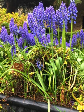
My garden is filled with so many beautiful and unique flowers and I really wanted to tie them into my spring shooting assignment. This picture shows a grape hyacinth growing from the soil. It was tangled in other plants and the roots and I loved how realistic the growth and blooming took place. In spring there's a lot of blooming and rebirth of plants, this is how I captured that. For editing, I enhanced the vibrancy and saturation. I made it slightly cooler to make it look more rainy and wet. I finally cropped and straightened out the photo to make the flowers straighter.
|
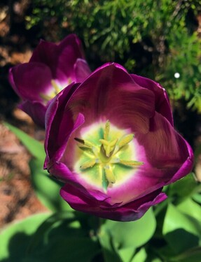
I took this picture of the inside of a tulip because I liked how the yellow and purple colours complimented each other. I started by cropping the image and zooming into the centre focus of the flower. Next, I went in with the healing tool to get rid of bright specs of pollen because I wanted the inside of the flower to look cleaner and more structured. I then used my feathering tool and brightened up the green bush in the background. And lastly I went in with some final tuning to enhance the vibrancy of the flowers.
|
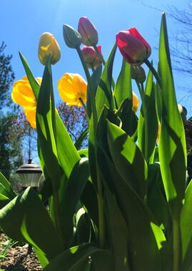
These spring time flowers were just starting to bloom. The sun was shining beautifully on them so i placed my camera just above ground level with the bottom of the stems so I could get a different view of the shapes and textures of the leaves. I began by cropping the photo and then I started by adjusting highlights, white balance, saturation, etc. I used the feathering tool to make the pink and yellow brighter to give it a little extra pop. The sky was already a deep blue so that was not an issue at all. I tried to get rid of the lamp in the background with the healing tool but it made the entire focus go to a random blob in the photo. I left it in to keep the main focus on the plant.
|
Hands
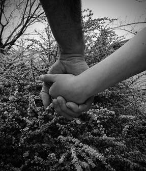
In this image, I had a father and son hold hands. I really wanted to compose an emotional and loving image, but also make it look very powerful at the same time. I edited this image in black and white using my apple editing app on my phone. Then, I went into face tune and made adjustments to the skin and background element (the bush). The edits were not too complex, I felt as if simple was the way to go in this case. Taking this picture was very heartwarming and meant a lot to the father and son. I personally really enjoyed using my family members to compose such beautiful image and they really seemed to love it after I was done.
|
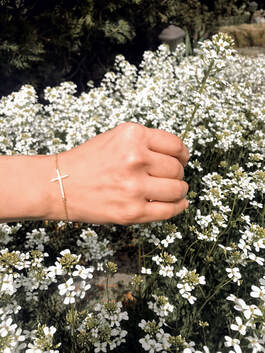
This photo was edited in colour but, I toned down the vibrancy and saturation to give it a very calm and peaceful look. I did all of my edits on face tune which allowed me to soften the skin and add shimmer to the cross bracelet. I really wanted the bracelet to be the main focus. By pairing the hand with the flower bed, I believe it made for a very beautiful and elegant composition. This displayed the hand very beautifully.
|

This photo had the most edits done. I was able to get a beautiful shot of a hand reaching for a chess piece. In the original image, the background was very busy and had a lot going on. It completely withdrew the main focus of the hand. I started by making the background black and white on Pixlr. Then left me with the very distracting background to cover up. i went in with the black feathering tool to fill in each of the crevasses that made up the background. Once I finished this the photo turned out very bold and eye catching. I was very pleased with the way this turned out in the end.
|
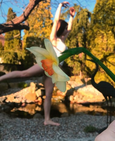
Forced Perspective
|
Composing this picture was more difficult than it looks. I am glad I was able to complete the assignment in the end, but there were difficult parts to this. The hardest part was getting the foreground and the background to stay in focus. After much frustration trying to take pictures and them not turning out I realised with shooting on an IPhone I was only able to get either foreground or background to focus. Not both at the same time. I had to work with that so I decided to use my object as the main focus, in this case it is the flower. I myself am not in focus. I realised even though the background is a bit blurry, it still makes for a beautiful composition. After getting a shot I was happy with I decided to edit on PixlrX. I first adjusted the picture to make it straight and up to scale. Then I wanted to give it a warm feel and enhance the sunset aspect. I was able to use the drawing tool and completely make the flower vibrant. Since it is the main focus as the skirt I wanted to make it pop. Over all, I was glad this turned out the way it did.
|
Photo Essay
"Day in a Life"- slide show
Glasses and Bottles
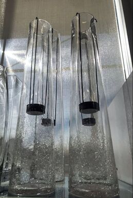
When I began to edit this image, I started by finding the white balance. once I did that I wanted to focus on bringing out the cooler tones. The sun shown on the white walls and made them a bit yellow which then made the glasses yellow. So I decided to make it a brighter white colour. I fixed the highlights and exposure making it a brighter picture to enhance the main focus. I had cropped this picture because I did not like how there was another object beside the main focus, It made the entire picture look off balance. Overall, I really liked the way the glasses looked with the rays of sun in the back. It gave a nice balance of brightness and clarity.
|
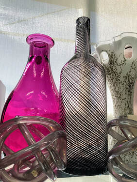
With this picture, I wanted to keep a few of the warmer tones so I decided to make it brighter and increase the warmth. This allowed me to fill in the bottle and make it a brighter pink colour. My goal for this edit was to increase the vibrancy and to really make the details and designs on the glasses stand out. I accentuated the details by increasing the clarity. I thought the glass bottles stood out and they were different then just regular glasses. The glass figures at the bottom make the image more interesting. This is why I decided not to crop it out completely. I thought it worked well with the composition.
|
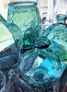
These glasses had a very interesting shape, and I really liked the way they looked together. It took a while to find the right angle in order to show the detail in each glass. I finally decided to edit this one because the lighting was very good and the composition worked well. I started by finding the white balance, this was important in order to make the glasses have a clear affect. I also added a green tint to the picture to allow variation in the colour of the glasses. They were all the same colour in real life, but by fixing the lighting and colour, it changed the appearance completely.
|
Winter Wonderland
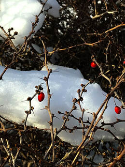
Since the snow was starting to melt I found it difficult to find a nice shot where the snow would still be solid. That's when I realised I wasn't going to get anything good unless I zoomed in more. This is a berry bush that had very little snow on it, but it still gave a nice winter feel. When I took this picture to light room I was able to edit the berry's to make them a brighter red. I also used the whiter to brighten up the snow. I used the feathering tool to darken the branches and make them stand out. This was a quite simple edit because I had very nice natural light from the sun.
|
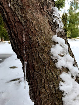
As I was doing my shooting assignment, I was really hoping to get a picture of something with ice or icicles. I didn't think I would find one since the snow was progressively melting. Then I saw this icicle barley hanging on the bark and knew instantly that I needed to snap a shot of it. The now in the background had a lot of dirty and patchy spots so I went in with the healing tool to clean up the area a bit. Next, I worked on making the trees in the background more vibrant. They looked too much like the bark itself in the original image, so to made them stand out more I used the feathering tool to enhance the colour. I then went in with the whitening tool and made the snow brighter. I really loved the way this one turned out in the end after the edits.
|
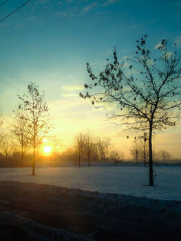
I was on my way to school one morning when I took this picture. I thought that the sunrise was so gorgeous and had to get a picture of it. The snow in this picture makes it look so calm and peaceful. I also love how the sky is a gorgeous blue, orange and yellow. When I edited this I made sure to enhance those colours. This made the picture really stand out. I darkened the bottom with the feathering tool to draw your eye more towards the sun. This was probably my favourite picture because I enjoyed editing this to make it brighter and more vibrant. Out of all three pictures, this one makes me feel like I am in a winter wonderland.
|
Patterns
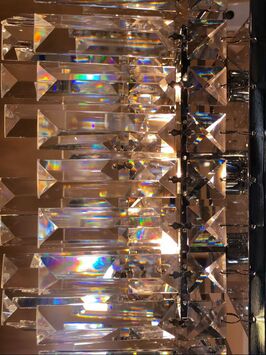
This pattern is of a chandelier, I originally took this picture horizontally, but I ended up making it a vertical image. At first, the rainbow light effect was not very detailed. After I enhanced the brightness and found the white balance, The true colour of light and reflection off the crystals was shown. I just made sure to adjust the exposure and highlights in this picture while editing.I did not want to add any feathering because it was not necessary to take away from the original crystal shape. I loved this pattern and chose it because it was unique and beautiful.
|
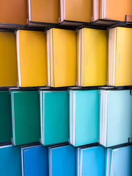
For my next photo, I deiced to take a picture of a wall of paint chips. The lighting inside the case was very good and I knew it would make for a good picture. The colours also contrasted very well together, moving in almost an effect from the darkest to the lightest shades. While editing, I adjusted the subject making it straighter and more pleasing to the eye. I also enhanced the vibrancy to make the colours really stand out and show. Over all I only enhanced the saturation and vibrancy. I also made the spaces between the chips darker to really bring out the shape of the actual squares.
|
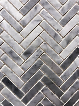
These are tiles that I thought had a really nice grey, marble pattern to them. The way the tiles were laid out was very eye-catching. I found the white balance to start and worked off of that. I wanted to make the bottom of the image darker then the upper tiles. This ended up looking very intricate. I loved the way the darker grey tones blended into the lighter grey tones. To start this image was more on the warmer side. But after edits I brought out the true cool grey tones within the subject.
|
Valentines Day
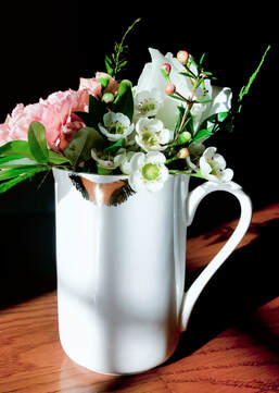
The main subject in this photo is an arrangement of flowers in a mug. The lips on the mug give the image a romantic feel. It exemplifies the theme very well. I chose to place the mug on the hard wood floor in front of a window that had a good source e of light. This was taken just before golden hour. The natural light in this image really makes the white balance pop. I positioned the mug so that the angle and perspective was pleasing to the eye. With Light room I was able to bring out the true green in the leaves. This made a big difference in the subject. The saturation edits made a brighter and more vibrant product.
|

I took this picture in a coffee shop. it was very dark inside and the lighting was poor as you can see from the original image. I wanted to make the main subject, which are the hearts in the coffee cups to be the main focus. After finding the white balance, I was able to make the coffee stand out and darken the background. This is not an average red and white valentines day picture, but I loved how different each heart was. I wanted to make the image brighter, leaving the whites, white and the dark's, dark. In the end I was pleased with how this image turned out even though the lighting was not the greatest.
|

Knowing roses are the most romantic flower, I deiced to incorporate it with the bracelet I held above to create this subject matter. After cropping the image to get a better zoom on the detail inside the flower, I was able to find the white balance. I went in later with the feathering tool to darken the middle area of the rose to make the charm on the bracelet stand out more. My goal was not to completely hid the background, I still wanted to leave that open to bring in more light to the image, so the middle of the image, still being dark, gradually became lighter moving toward the outer corners.
|
